Roller banner design: a layout people read in three seconds
Where to put the logo, the headline and the details on a 2 m tall banner, how to use photos and QR codes, and how to design banners that stand side by side.
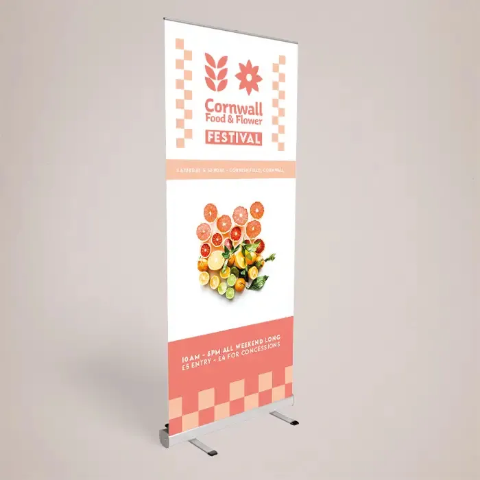
On this page 11 sections
- 1. Design from the top down
- 2. Write a headline, not a slogan
- 3. Size text for the aisle
- 4. Keep the words down
- 5. One strong image
- 6. Use colour for contrast, not decoration
- 7. QR codes: only where people stop
- 8. Design pairs and trios as a set
- Roller banner design by use
- Roller banner design mistakes to avoid
- Which size suits your design
Good roller banner design puts the one thing you want people to know at eye level, near the top, in type big enough to read from across an aisle, and leaves the lower third almost empty. A roller banner is 2 m tall and stands on the floor, so visitors see the top half first and the bottom half hardly at all, especially once a table or a crowd is in front of it.
These eight rules cover the layout, the words and the pictures. For file set-up (size, bleed, resolution), see our separate guide to roller banner artwork setup.
1. Design from the top down #
Split the banner into three zones:
- Top third: logo and headline. This is at or just above eye level for most adults and is what people see across a room.
- Middle third: the supporting detail. Three short points, one photo, or a short list of services.
- Bottom third: contact details high in this zone, then background only. The bottom 150 to 200 mm can be hidden by the base or a table, so keep it clear of text.
If someone only reads the top third, they should still know who you are and what you do. That is the core of roller banner design.
2. Write a headline, not a slogan #
Most people glance at a banner for a second or two while walking, so there is no time for them to decode anything. The headline should say what you do or what you are offering, plainly: “Commercial electrical contractors”, “Free hearing checks today”, “Now enrolling for September”. A clever slogan without context makes people work, and in a busy hall they will not.
3. Size text for the aisle #
At an exhibition or event, people read your banner from 2 to 5 m away as they walk past. Headlines around 100 to 150 mm tall are comfortable; supporting text should not drop much below 30 to 40 mm. Anything smaller is reading material for people who have already stopped, and they can talk to you instead.
4. Keep the words down #
A strong roller banner design usually has fewer than 30 words in total. Cut sentences to phrases. Cut lists to three items. If you need to say more, put it on a leaflet on the table, with a clear link between the two. A useful exercise is to read the whole banner aloud: if it takes longer than about ten seconds, it is carrying too much.
5. One strong image #
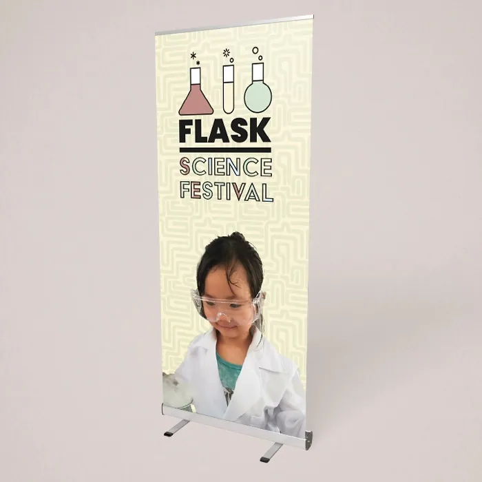
A single photo that shows your work, your product or your team does more than a collage. Tall banners suit tall photos, such as a person standing, a building or a product shot from low down. Make sure the photo is sharp at full size, about 150 dpi at 850 × 2000 mm, which means starting from a camera original rather than a web image.
Do not run text over a busy part of a photo. Put text on a plain area or on a solid band of colour.
6. Use colour for contrast, not decoration #
Your brand colours can fill the background or a band across the top, but the text needs strong contrast against whatever is behind it. Mid grey on white, or red on dark blue, looks fine on a laptop and disappears under exhibition hall lighting. The guidance on colour contrast used by web designers is a good check for text colours.
If the banner will stand in front of a window or a spotlight, choose blockout roller banners so the light behind does not show through and wash out the colours.
7. QR codes: only where people stop #
A QR code is useful on a roller banner at a stand or reception, where people are standing close. Put it in the middle zone at chest height, at least 150 mm square, with a line saying what it opens (“Book a survey”, “See the menu”). Test it from 2 m away with a few phones before you order. Leave it off banners people see only from a distance.
8. Design pairs and trios as a set #
Two or three 850 mm banners side by side can make a wall behind a stand. Design them together:
- Put the logo and headline on the centre banner or across the tops of all of them at the same height.
- Keep the same background colour and the same top band on each.
- Give each banner its own job: one per service, product or message.
- Do not run text across the gap between two banners; the gap always falls in the wrong place.
Roller banner design by use #
The same rules apply everywhere, but the emphasis changes with where the banner stands.
| Where | Lead with | Middle zone |
|---|---|---|
| Exhibition stand | What you do, in five words or fewer | Three benefits or three services |
| Reception or shop | Logo and a welcome or a current offer | One photo, opening hours or a QR code |
| School or college open day | School name and the event | Directions, subjects or a photo of pupils (with consent) |
| Conference speaker | Event or organisation name | Sponsor logos in a tidy grid |
| Trade counter | Your trade and a phone number | Accreditation numbers as text, main services |
Whatever the use, check the finished roller banner design by standing 3 m from your screen with the design at full screen height. If the headline is not obvious in three seconds, make it bigger or cut words.
Roller banner design mistakes to avoid #
- Text in the bottom 200 mm, hidden behind the table.
- Important text within 30 to 40 mm of the side edges on narrow banners.
- A web address, an email, two phone numbers and five social icons. Pick one or two.
- Small logos. On a 2 m banner, a logo can be 300 mm wide or more.
- Re-using a landscape design squeezed into a portrait banner.
Which size suits your design #
The standard 850 × 2000 mm roller banner suits a logo, a headline and three points. Wider banners, such as 1000 × 2000 mm, give room for a photo beside the text. Our roller banner buying guide compares every width.
You can build your roller banner design in our free online designer, which shows the hidden base area, or upload your own print-ready file for a free file check by a person. If you want help, our paid typesetting service sets out your text and logo with 1 design and 2 rounds of changes. Browse all roller banners to compare stands and materials.