Sign letter height and viewing distance
Allow about 25 mm of capital height for every 3 m of viewing distance. A table from 3 m to 50 m, font sizes in points, safety sign sizing and three worked examples.
Last updated
For sign letter height, a reliable sign-trade rule of thumb is 25 mm of capital letter height for every 3 metres of viewing distance, and never less than half that. A headline read from 15 m needs capitals of about 125 mm; one read from 3 m needs about 25 mm. Safety signs are sized a different way, by the size of the whole sign. The tables and worked examples below show how to apply both.
Sign letter height by viewing distance #
Measure the distance from where people will be when they need to read the sign: across the road, at the car park entrance, at the back of the hall. Then read across:
| Viewing distance | Capital height to stand out | Smallest readable capitals |
|---|---|---|
| 3 m | 25 mm | 13 mm |
| 5 m | 42 mm | 21 mm |
| 10 m | 83 mm | 42 mm |
| 15 m | 125 mm | 63 mm |
| 20 m | 167 mm | 83 mm |
| 30 m | 250 mm | 125 mm |
| 50 m | 417 mm | 208 mm |
Use the “stand out” column for headlines and anything people must notice in passing, such as your business name or a phone number. The smallest column is for detail that people will stop and read, like opening hours on a door. Our artwork guidelines use the same 25 mm per 3 m rule.
Turning letter height into a font size #
Design software sets text in points, not millimetres, so sign letter height has to be converted, and a font’s point size measures more than its capitals. One point is about 0.353 mm, and in a typical bold sans serif the capitals are roughly 70% of the point size. That gives a handy shortcut: font size in points ≈ capital height in mm × 4, measured at full size.
- 25 mm capitals: about 100 pt.
- 83 mm capitals: about 330 pt.
- 125 mm capitals: about 500 pt.
Fonts differ, so check by measuring a capital “H” on screen at 100% zoom, or print a single letter on A4 at full size and hold it up at the distance you measured. If you design at 1:10 scale, divide the point size by 10.
Safety signs use a different sizing rule #
For safety signs, what matters is the size of the whole sign, because the symbol, colour and shape do most of the work. Following the distance-factor method in ISO 3864-1, our safety sign colours and shapes guide allows about 1 metre of viewing distance for every 25 mm of the sign’s shorter side:
- A4 (210 × 297 mm): readable up to about 8 m.
- A3 (297 × 420 mm): up to about 12 m.
- A2 (420 × 594 mm): up to about 17 m.
- A1 (594 × 841 mm): up to about 24 m.
The legal duty to provide safety signs comes from the Health and Safety (Safety Signs and Signals) Regulations 1996; your risk assessment decides where they go. In poor light or where people move fast, go a size up.
Worked examples of sign letter height #
An A-board on the pavement
An A-frame pavement sign with an A1 poster (594 × 841 mm) is mostly read by people walking along the pavement, 3 to 10 m away. For 10 m, the headline wants capitals of about 83 mm. At that size a 594 mm wide poster fits roughly eight to ten capitals per line, so the headline is two or three short words (“Coffee to go”, “Open today”). Prices and offers underneath can drop to 40 to 50 mm, because people read them as they slow down.
A 6 ft × 3 ft banner on railings
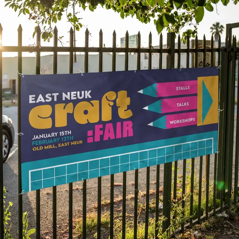
A 6 ft × 3 ft (1829 × 914 mm) banner facing a road is often read from 15 m or more. That means capitals of around 125 mm for the main line. The banner is 914 mm tall, and hems and eyelets take the outer 50 mm, so there is room for a 125 mm headline, one line of 60 to 80 mm detail and a phone number, with space between them. Anything more and every line shrinks. Our online designer flags banner text with capitals under about 40 mm on this size as hard to read from 10 m.
An A2 site sign
A printed notice on an A2 Correx board (420 × 594 mm) at a site entrance might be read from 10 m by drivers pulling in. By the letter rule, the key words want about 83 mm capitals, which allows only around five or six capitals across the 420 mm width in portrait. A short instruction (“Site office”, “Deliveries”) works; a paragraph does not. If the sign carries a safety symbol, the safety rule above says an A2 sign reads to about 17 m, so the symbol will be seen before the words.
Other things that affect readability #
Sign letter height is only part of the picture. The same size of text can read well or badly depending on these:
- Contrast. Dark on light or light on dark. Black on yellow and white on dark blue carry well; red on green and grey on white do not.
- Font. A plain bold sans serif reads furthest. Script, thin and condensed fonts need to be much larger to read at the same distance.
- Case. Capitals suit a short headline. For more than four or five words, mixed case is easier to read, but size it by the capital height.
- Speed. Drivers have seconds, not minutes. For traffic, use fewer words rather than smaller ones.
- Space. Leave clear space around each line. Crowded text reads as one grey block.
Getting the distance right in the first place is covered in how to measure for a banner, and sign letter height on a tall display is covered in roller banner artwork.
Still not sure? #
Tell us the size of the sign, the wording and how far away people will be, and we will tell you whether it will read. Call 0161 315 1151 or use the contact form.