Banner design tips: words, colours and layouts that read from the road
A banner gets a few seconds of attention from someone walking or driving past. These design tips cover what to say, how big to make it and which colours stay readable.
On this page 12 sections
- 1. Decide the one thing the banner must say
- 2. Use fewer words than feels comfortable
- 3. Size the lettering for the viewing distance
- 4. Contrast beats colour
- 5. Pick plain, bold fonts
- 6. Give the layout a clear order
- 7. One strong photo or none
- 8. Make the contact detail easy
- 9. Check it at a distance before you order
- Mistakes these banner design tips prevent
- Banner design tips for different jobs
- Designing it yourself or getting help
The most useful banner design tips all come back to one fact: people read a banner in passing, usually from several metres away, and give it a few seconds at most. A design that works on a laptop screen at arm’s length can be unreadable on a fence across the road, so every choice below is about what survives distance and speed.
Use these nine rules whether you design in our online designer, in your own software, or brief a designer.
1. Decide the one thing the banner must say #
Before you open any design tool, write down the single message. “Now open”, “Sale this weekend”, “Book your MOT here”, “Places available for September”. Everything else on the banner supports that message or gets cut. A banner that tries to list every service ends up saying nothing to someone driving past.
2. Use fewer words than feels comfortable #
Word count is where most banner design tips start, and for good reason. A good target is a headline of three to seven words plus one line of detail and one way to get in touch. If you find yourself adding a third line of services, ask whether it belongs on a leaflet or your website instead. Of all the banner design tips here, this is the one people most often ignore.
3. Size the lettering for the viewing distance #
A reliable sign-trade rule is 25 mm of capital letter height for every 3 metres of viewing distance. A banner read from across a road (around 10 m) wants capitals of at least 83 mm; one read from 20 m wants about 167 mm. Our article on sign letter height and viewing distance has the full table and how to convert millimetres to font sizes.
Work this out before you choose a banner size. If your headline needs 125 mm capitals and has 20 letters, it needs a banner wide enough to hold it.
4. Contrast beats colour #
Dark text on a light background, or light text on a dark background, reads from much further away than two mid tones. Yellow on white, pale grey on white and red on green are common mistakes. If you want to check a colour pair, the web accessibility guidance on colour contrast explains the contrast ratios designers use; the higher the ratio, the easier the text is to read.
Use your brand colours for the background, a band or the logo, and keep the text itself in the highest contrast colour you have.
5. Pick plain, bold fonts #
A bold sans serif is the safest choice for headlines. Thin, script and heavily decorated fonts lose their shape at a distance. Keep to one or two fonts on a banner. Avoid all capitals for long lines; a short headline in capitals is fine, but a sentence in capitals is slower to read.
6. Give the layout a clear order #
Readers should see the headline first, then the supporting line, then the contact detail. Make that order obvious with size: the headline biggest, the detail smaller, the contact line smaller again but still readable. Left-aligned or centred both work; mixing the two on one banner looks untidy.
Leave space
Empty space is not wasted space. A margin around the text and a gap between blocks make the banner easier to read at a glance. Keep all text and logos at least 5 cm in from the edges, where the hems and eyelets go.
7. One strong photo or none #
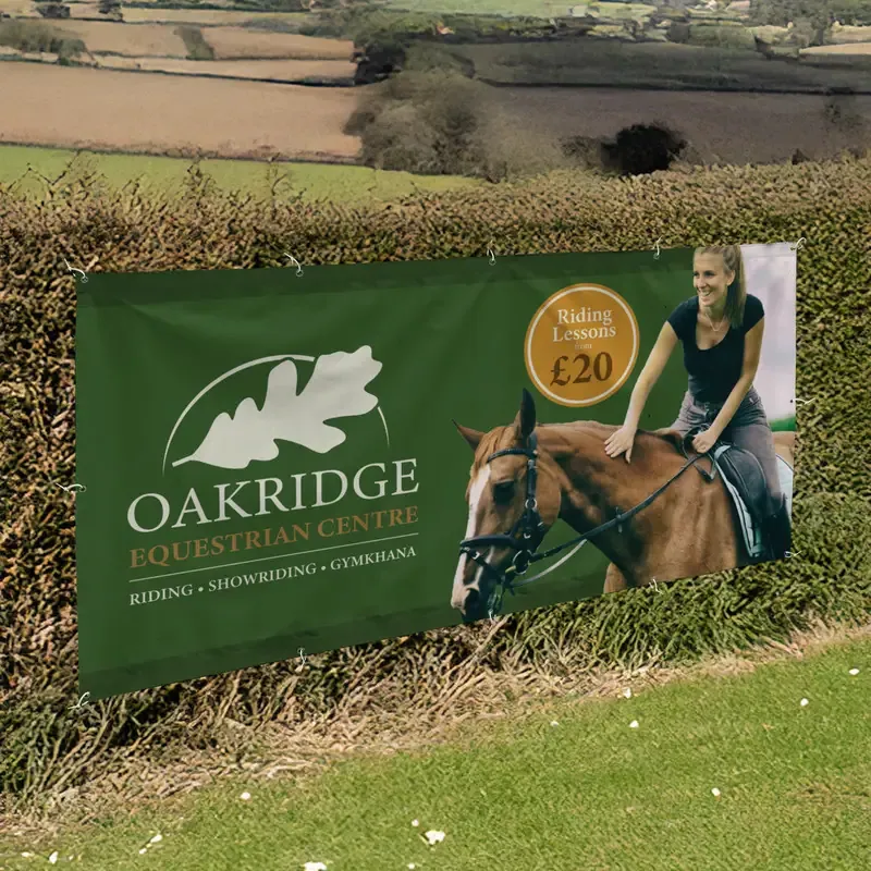
A single clear photo of your product, your van or your finished work can do a lot. A collage of small photos cannot be read from the road. Photos need to be sharp at full size, so use the original file from the camera rather than one saved from social media.
8. Make the contact detail easy #
Choose one: a phone number, a short web address or your social handle. A phone number should be large enough to read at the same distance as the headline, because that is what people will try to remember. QR codes can work on banners people walk up to, such as at an event, but not on banners read from a car.
9. Check it at a distance before you order #
Print your design on A4, stick it on a wall and step back to the distance that matches the real scale. Or zoom the design out on screen until it is about the size the banner will look from the street. If you cannot read the headline in two seconds, the words are too small or there are too many of them.
Mistakes these banner design tips prevent #
- The website designer’s layout. A layout built for a web page, with small text in columns, does not scale up into a banner. Start again with the banner size in mind.
- A logo that is too small. If your name is only in the logo, the logo has to be big enough to read. Otherwise add the name as large text.
- Everything the same size. When every line is the same height, nothing stands out and the reader has to work out the order.
- Dates on a banner you want to reuse. Leave dates on a separate small banner or sign, so the main one works again next time.
- Background photos behind text. Busy photos behind lettering kill contrast. If you must use one, put a solid band behind the text.
Most of these come from treating the banner like a flyer. Keep coming back to the basic banner design tips above and the finished banner will do its job.
Banner design tips for different jobs #
| Job | What to lead with |
|---|---|
| Shop opening or new owners | “Now open” plus your name and what you sell |
| Trade van or site fence | Your trade, your name, one phone number |
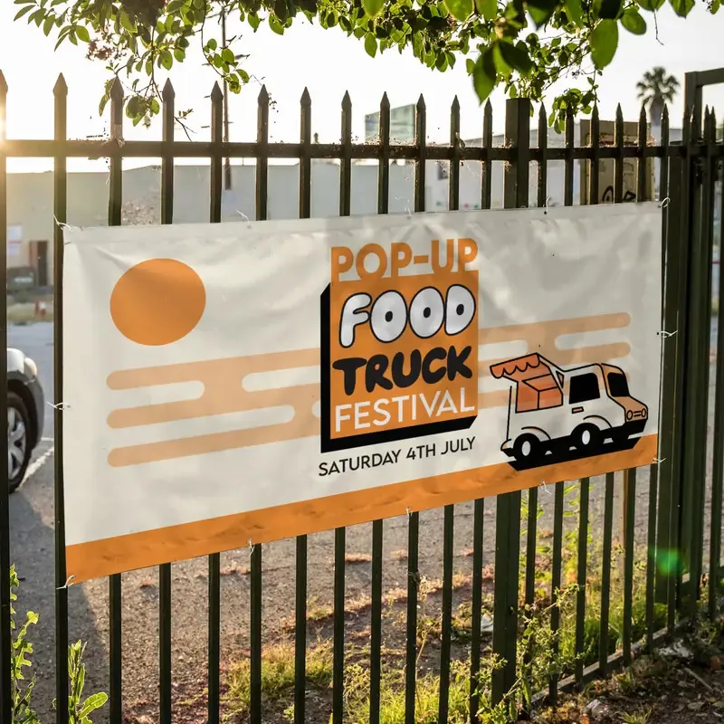
| Sale or event | The offer or the event name, then the date |
| School or club | The one action you want: “Now enrolling”, “Join us” |
For more ideas by job, see our banners range, where each type of banner has templates to start from.
Designing it yourself or getting help #
Our free online designer has templates for business banners, PVC banners and many more, sized correctly with the safe area marked. You see exactly what you’ll get before it goes in the basket. The step-by-step guide to designing a banner online walks through it.
If you would rather hand it over, our paid artwork service will set out your text and logo for you. The typesetting option includes 1 design and 2 rounds of changes, so you see the layout before it is printed.
Whichever route you take, these banner design tips come down to the same test: can someone read it in two seconds from where they will actually be standing?